Assessing the Impact of Patch Releases on Digital Assets in DOTA 2
Abstract: This study examines the effect of a game patch on hero balance in Multiplayer Online Battle Arena (MOBA) games, focusing on changes in hero damage output. Utilizing ANOVA tests and statistical analyses, including Kruskal–Wallis ANOVA, Mann-Whitney U test, Kolmogorov-Smirnov test, and Bootstrapping in Python, data from ranked matchmaking sessions were analyzed to assess the statistical significance of damage output changes according to the official changelog. Findings reveal Shadow Fiend as the standout hero with increased gold collection, tower damage, and victories due to the ‘Requiem of Souls’ ability’s enhancement with the “Aghanim’s Scepter” in patch 6.86. In contrast, Zeus was identified as having the highest damage output, attributed to a character remodel, its role as Soft Support, and its straightforward playability. The study offers insights into the implications of game patches on hero performance, providing a foundation for further game design and balance discussions.
⚠️ Introduction to problem
Hypothesis
For online multiplayers, sustainability mirrors the voice of customers. In the case of DOTA, the platform’s exclusivity due to the ownership of its developer, Valve Corporation, make it more reachable to gather community reviews on time from the Steam store. This, in comparison to other games' developers, who might require to access an endpoint to connect to Steamworks API to perform the same task.
The Consumer Insights team at Valve gathered all the internal reviews and external’s from social networks of high traffic in this niche, like Reddit. After an exhaustive NLP analysis, the team has found that players tend to comment about Nerfing and Buffing heroes, which is very common in MOBA games when every patch is released. And, since patch 6.86 was released on December 16 of 2015, also known as Balance of Power, the team has found many comments about this topic, so they require to generate actionable insights to let the Game Designers take action on time.
After carefully collecting player logs since the released date of this patch, they need to test if effectively the heroes’ stats are unbalanced or not. As the main interaction between enemy players is measured by the damage dealt, this will be defined as the core KPI of this study and with this, we will define our hypothesis as:
-
$H_0:$ After the release date of patch 6.86, the heroes have recorded a statistically equal damage.
-
$H_1:$ After the release date of patch 6.86, the heroes haven’t recorded a statistically equal damage.
Potential Stakeholders
-
Level Designers: if the heroes are balanced in terms of damage, the damage dealt by the creeps will require an investigation, which depends on the design of the map lanes. They must hit a balance between creating easy or hard experiences, and this will rely on the creeps per lane. Another mapping issue that would need to address is the jungle, which is typically filled with creeps that players can kill for rewards, which the designers require to define how challenging they should be to defeat.
-
Character Designer and Engineers: they evaluate the design of the heroes to be certain that each team is balanced, and confirm there is no side having an unfair benefit. In such cases will have to rebalance the hero stats with the help of the Gameplay Engineer, and adjust the HUD with the help of a Systems Engineer.
-
User Retention team: by working around the Data Analysts, they will support delivering the final report to the Lead Game Designer, about the potential effect on the players' retention in case of not taking quick actions, in the scenario of having a true Null Hypothesis.
-
PR team and Community Manager: they must be aligned to deliver an accurate Patch note with an accurate summary of the next patch to be released.
-
Players community: as the main stakeholder, the core sustainability of this IP comes from the community engagement, so they expect to have a more balanced experience at least for patch 6.86b.
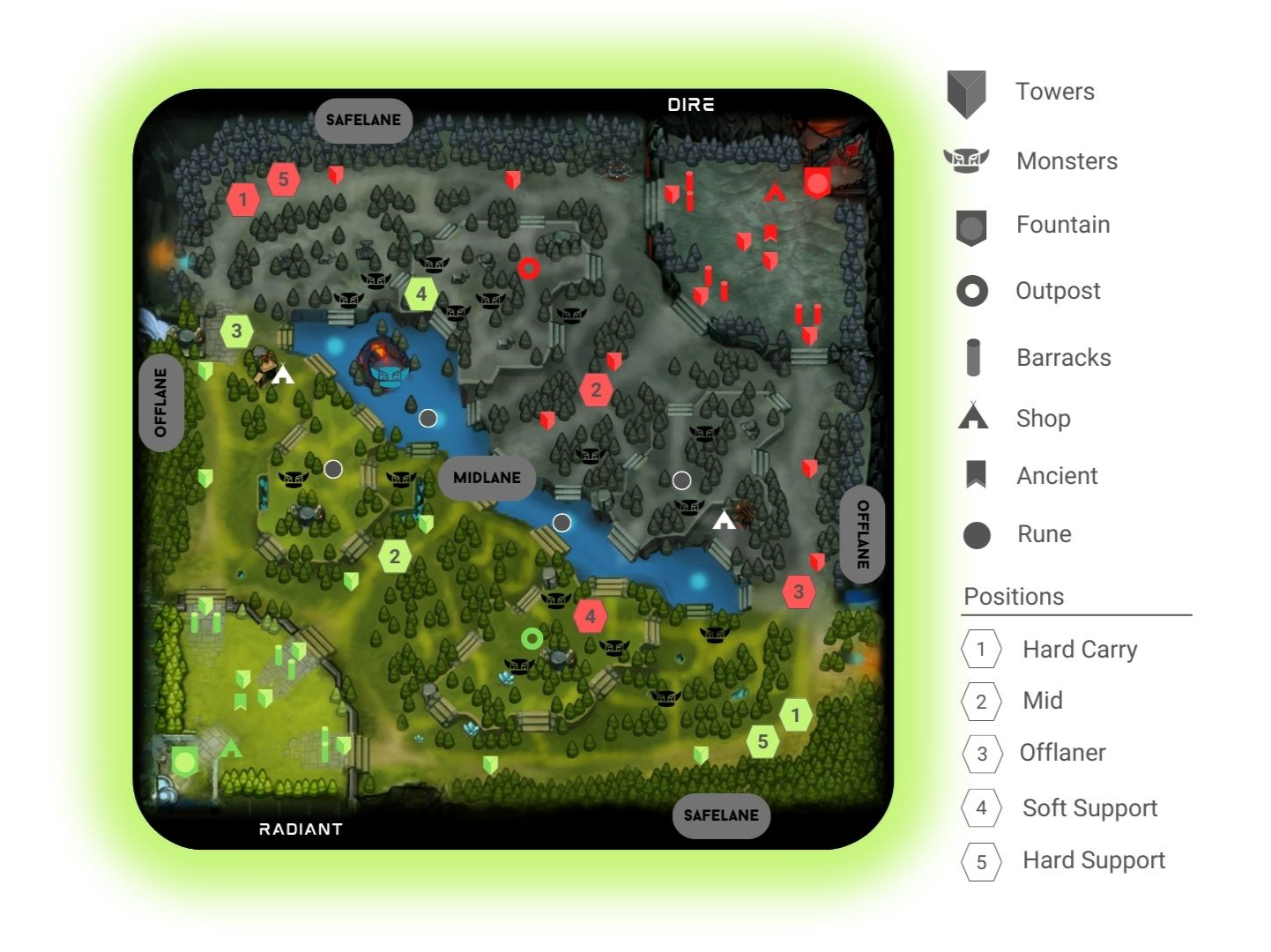
Note: To facilitate the understanding of the roles of the development team, I invite you to take a look at this diagram that I designed.
📥 About the data
This dataset was collected on December 17th of 2015 from a sample of Ranked Matchmaking mode, which holds information from 49,855 different contests, where 149,557 different players formed part of them.
As we mentioned in the preprocessing notebook, the raw extracted data can be found in the YASP.CO collection from Academic Torrents. This dataset was uploaded and gathered by Albert Cui et. al (2015). However, you can extract your sample from the OpenDota API query interface for the comfort of use.
Collection process and structure
According to Albert Cui et. al (2014), OpenDota is a volunteer-developed, open-source service to request DOTA 2 semistructured data gathered from the Steam WebAPI, which has the advantage of retrieving a vast amount of replay files in comparison to the source API. The service also provides a web interface for casual users to browse through the collected data, as well as an API to allow developers to build their applications with it.
The present sample can be found in an archive of YASP.CO, which was uploaded for the same developers of the OpenDota project, Albert Cui, Howard Chung, and Nicholas Hanson-Holtry. Due to the size of the data (99 GB), we won’t find the raw data in the Github repository of this project, however, you will find a random sample with its respective preprocessing explanation in a Jupyter Notebook.1
As a suggestion, to preprocess data of this size, the most accurate solution is to use parallel computing frameworks like Apache Spark to do the transformations. Web services like Databricks with its Lakehouse Architecture, let us process semi-structured data with the capabilities of a Data Warehouse and the flexibility of a Data Lake, and to do this you can use the Data Science and Engineering environment of the Community Edition for free.
Without diving deeper, let’s import the initially needed packages and the preprocessed data.
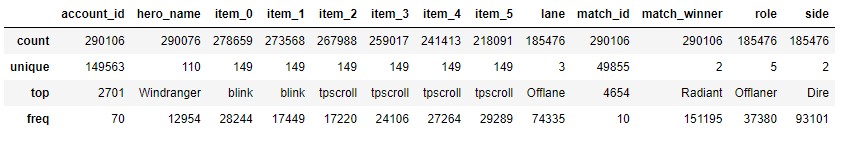
|
|
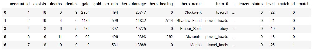
As we can notice, in our data we have a total of 28 attributes, however, not all of them will be used in this study but for future investigations of extra user metrics, we see that all the assembled data could be a useful asset. In such case you require the description of one of these attributes, please guide yourself with the Appendix at the end of the preprocess notebook, where you will find a punctual explanation.
🔧 Data Preprocessing
Almost every transformation was made on the preprocessing notebook, there you will encounter different blocs like the joins of hero descriptions, items used per session, and match outcomes to the main table of players' registries. In the end, also will be a distribution study, to exclude outliers based on irregularities recorded on sessions (impossible values). Knowing this, we can say that the data is ready to go, so we can skip the Data Cleaning section. Here we are going to do an overall inspection.
Data Consistency
Considering conceivable errors in the telemetry logs, we require to validate the lack of missing values on each one of the features.
One of the attributes that required a substantial transformation to infer and extract descriptive values for each player was the “player_slot”, which is no more in the present dataset. This value was an 8-bit unsigned integer, where the first digit defined the faction (Radiant | Dire), the next four digits were empty and the last three defined the lane role of the player within the team. The encoding is part of the reason why there were present some missing data that wasn’t describing the record.
After the pruning was executed, the sample remain significant in size with 290,000 records, and by the next table, we can verify it.
|
|
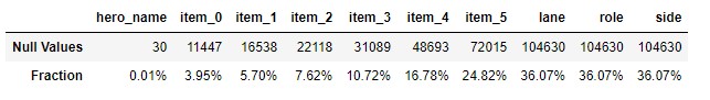
The columns with more NA values are the ones relative to the player position. In case of any comparison needed in terms of lane position, we will take another sample ensuring that we have a significant size to run our tests.
Data Distribution Validation
Every column is already transformed into its respective data type, and depending on the analysis needed we should require to retransform it or even apply a linear scaling method to be interpreted.
|
|
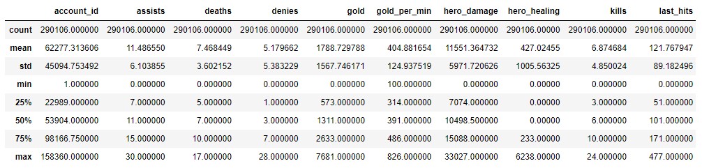
We can see each value defined by the percentiles, however, is preferable to have a straightforward vision to conclude about each feature.
|
|
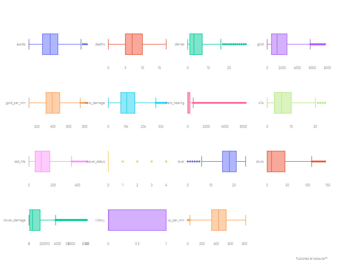
From the dispersal of each attribute, we can notice that most of the data is right-skewed. We don’t have any information bonded to system anomalies during data collection, so from the variables that we are going to use in our analysis, we can notice descriptive behaviors like:
-
Per session players usually report, on average, a total of 11 assists and 6 kills with a median hero damage score of 10,500.
-
There is a big segment of outliers from players who healed allies, with a value of over 233 points. Making general assumptions over its distribution wouldn’t be accurate, because that segment could be linked with the Hard Support role.
-
The same situation happens with the gold collected and the tower damage, where there is a great number of scores above the 75% percentile, which can be due to lane role differences like Soft Support which is usually a role used for Jungling.
In our exploratory analysis, we will have to study these metrics by lane, because each lane has different roles, and some aren’t directly comparable. Nevertheless, that’s also something that we’ll need to demonstrate with a hypothesis test between lanes.
🔍 Exploratory Analysis & In-game interpretations
Before going through the hypothesis test, let’s explore the behavior within the categorical variables to check the consistency within the descriptive attributes for the players on each lane.
|
|
At first sight, the most common role in our data corresponds to the Offlaner and the most used hero is Windranger, and this makes sense since is one of the heroes with a higher Win Rate on the Offlaner role according to DOTABUFF. Also, the two most used shop items are the Town Portal Scroll and the Blink Dagger.
But since we have numerous combinations between heroes and items, this might not be the most accurate way to make inferences. So let’s look at the combinations for the Radiant and Dire factions.
|
|
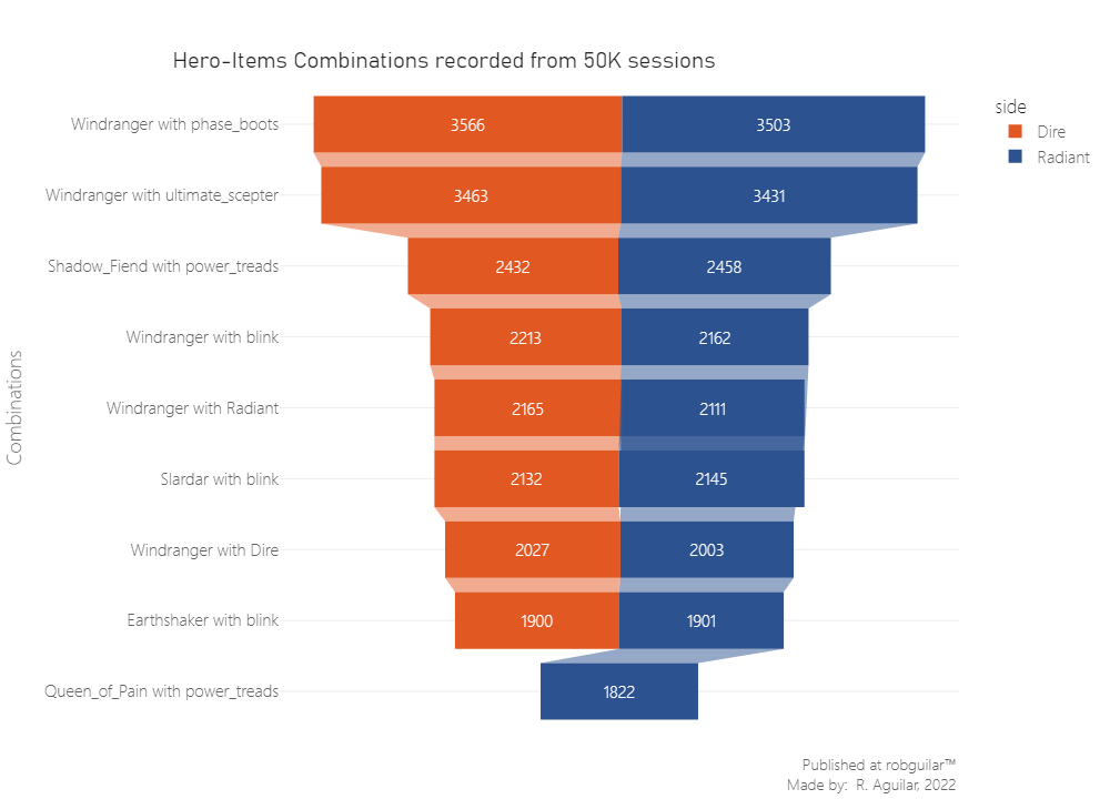
Now we can verify the initial statement that the Windranger is the most played hero, but at the same time, we can check that the Town Portal Scroll and the Blink Dagger are not the most used for this hero, meaning that their use is because of commonness and not because it’s a good fit for that hero.
-
Windranger it’s a ranged hero that can buff her stats by 3.75% in movement speed. According to Tan Guan, these boots supply the most damage out of any boots choice, and the six armor allows an Intelligence hero to have a mana-less option to chase the enemy down. Also, the Phase active brings you up to max movement speed with Windrun (another physical ability for movement speed).
-
The same case is for Shadow Fiend using Power Treads, where some advanced strategies are possible for players who like to micromanage or wish to maximize their efficiency in a competitive setting. Like switching the Power Treads to Intelligence before a fight to allow this hero to cast one more spell.
While examining patches, it’s always important to examine the performance of the character by sampling the player statistics. In such case of DOTA, it would let the designers decide which heroes need to be nerfed and which need to be buffed, by delivering changes in a patch log attached to the bottom side of the documentation website. To put you in context, nerfed means a negative effect on the hero’s stats, while buffed means the opposite, given an update (patch) on the game.
🗺️ Overview of Metrics by Lane Roles
We saw that generalizing about all the heroes and extracting insights, it’s not the best way to produce findings, because many times the perspective can bias our interpretations, especially while dealing with Big Data.
As we move on to the next analysis, the main intent is to narrow down our scope of analysis (data sample), so to start let’s compare the core metrics by role lane.
First, let’s see the scores for how much a player heals their allies' heroes, how much the player damages the enemys' heroes, and how many times each player dies on average, taking as a group the role assigned in the lane.
|
|
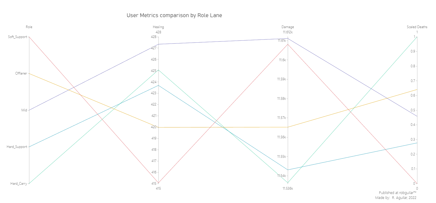
From the last visual we can drag the next insights:
-
Soft support is the role where they dedicate less effort to healing their teammates (due to their freedom is the role used for Jungling), while Midlaners dedicate more time to healing teammates. This is probably due to their high mobility during the session, and because they have the major responsibility to be the team’s playmakers, according to Zach the DOTA coach.
-
In terms of Damage dealt, we can say that by far Soft Support and Midlaners are the positions that dealt more damage, while Hard Carry is the opposite because they require a clear vision of the momentum between staying in the Safelane with the Hard Support or moving through the Offlane to attack enemy buildings.
-
As being a Hard Support is the less complex role to start, heal more, and damage less. According to Zach the DOTA coach, they need to farm a little and be actively healing their teammates. At the same time, they need to know where to be positioned, cause if one core is farming a lot, you will need to be actively doing the same; if one core is always in action they need to be healing.
We saw that Soft Support and the Midlaners have a very similar average of Damage Dealt per session, so we can analyze by checking the Kills logs by hero.
☠️ Kills logs comparison grouped by Role and Hero
The core interaction between enemy players is measured by Kills. We’ll compare the logs by groups; one being grouped by Role and another by Hero, keeping in mind that the main intent is to discover the more buffed heroes since the release of the last patch.
|
|
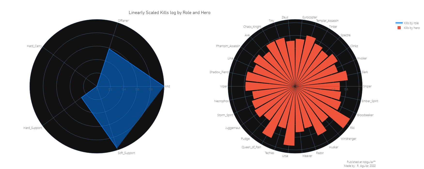
In terms of kills, we can justify these stats by looking at the updates given in the changelogs of patch 6.86:
-
Riki: since this hero was introduced with the new ‘Cloak and Dagger’ ability, he can become invisible each time attacks an enemy from behind, which is a perfect combination with ‘Blink Strike’ which was transformed into basic agility. This second gives the user bonus damage for attacks from behind and also does a quick teleport to the enemy’s back, giving more to use this combination.
-
Huskar: This hero received a hard magic resistance and attack bonus speed mechanical change with bonus changes from 5% to 50%.
-
Ursa: known as one of the heroes most used to Jungling, in this patch the ‘Aghanim’s Scepter’ was added to this hero which also let him cast the ‘Enrage’ ability while being stunned, slept, taunted, hidden, or during forced movement. The main use of ‘Enrage’ is to reduce the income damage by ~80%.
Midlaner and Soft Support are the roles with more kills registered, which are the 2 positions in which Riki, Huskar, Ursa, and Queen of Pain are used because they are in the Carry heroes category.
From the last global perspective of heroes and lanes, the purpose of the analysis is to let it evolve as granular as possible to handle detailed deductions, so let’s compare the Soft Support and Midlaner roles to decide on which to concentrate our study.
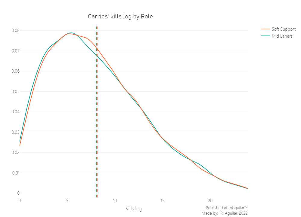
🧝🏻♂️ Two Sample Mann-Whitney Test for Kills logs by Role Lane for Carries
We still doubt which of the two roles is the one preferred to use Carry heroes, in other words, those that are used to rank up by logging as many kills as possible.
To do this we can run a two-sample t-test, so first let’s check the normality since this is a must-have assumption.
It’s important to mention that to respect the independence assumption, in the last code we extracted one record per player from a random resampled without replacement data frame. This is in case the player count with multiple sessions logged. For this test, we prefer to have a randomized sample where the groups are mutually exclusive, so a player can only belong to one role group.
|
|
|
|
It seems that both distributions are not normal, so we can’t proceed with a Two Sample t-test. For this reason, we’ll use a two-sample Mann-Whitney U test where our hypothesis will be defined by:
- $H_0: P(x_{kills_{mid}} > x_{kills_{soft}}) = 0.5$ (The probability that a randomly drawn player in Midlane will record more kills than a Soft Support player, is 50%)
- $H_1: P(x_{kills_{mid}} > x_{kills_{soft}}) > 0.5$ (The probability that a randomly drawn player in Midlane will record more kills a Soft Support player, is more than 50%)
This test makes the following assumptions:
- The two samples data groups are independent
- The data elements in respective groups are continuous and not-normal
Let’s start by plotting the distributions.
|
|
So now that we know that our sample is independent and not normal, let’s make the hypothesis test.
Notice that each one of the samples under test has a size of 13,000 records approximately. Seeing that our sample is very large, the test is at risk of incurring in normality bias. To avoid this, we are going to rely on an Asymptotic P-value calculation, which will generate a standardized value given by:
$z = \frac{U - m_u}{\sigma_U}$
Which is defined by:
$m_U = \frac{n_{Mid} n_{Soft}}{2}$
And our Standard Deviation Value won’t be affected by tied ranks, so this won’t require any correction. This is because the categories don’t have ranks and all the values are distinct and continuous.
$\sigma_U = \sqrt{\frac{n_{Mid} n_{Soft} (n_{Mid} + n_{Soft} + 1)}{12}}$
|
|
|
|
Since the distributions are statistically equal seeing the p-value above 0.05, we don’t have enough statistical evidence to reject our Null Hypothesis. This indicates that Soft Support players and Midline players tend to make the same amount of kills per session on Ranked Matchmaking mode using heroes of Carry type.
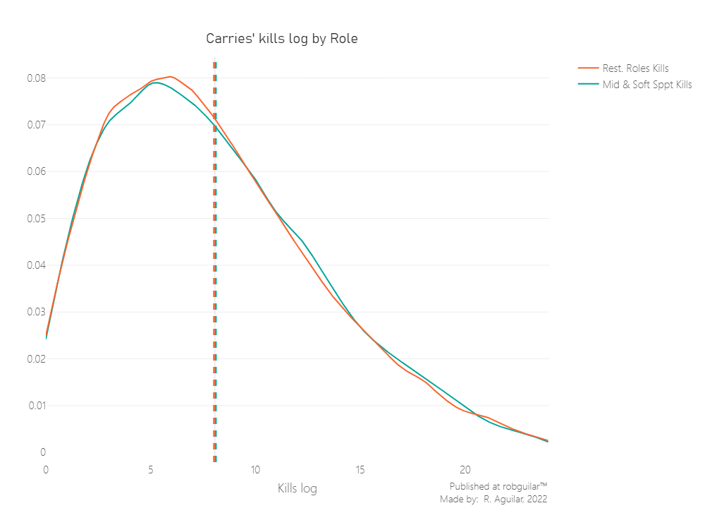
Now that we know this it doesn’t make sense to separate Mid Laners from the Soft Support group, let’s regroup these two positions and compare them with the rest of the roles.
🧝🏻👹 Two Sample Mann-Whitney Test for Kills of Mid Lanes and Soft Support vs Rest of Roles
Let’s start by defining the new hypothesis:
- $H_0: P(x_{kills_{mid \cup soft}} > x_{kills_{rest}}) = 0.5$ (The probability that a randomly drawn player from Midlane or Soft Support will record more kills than any player, is 50%)
- $H_1: P(x_{kills_{mid \cup soft}} > x_{kills_{rest}}) > 0.5$ (The probability that a randomly drawn player from Midlane or Soft Support will record more kills than any player, is more than 50%)
Using the same process as before, our first assumption to check is the non-normality of the same random sample for each group.
|
|
|
|
Now that we know the sample are not normal, we can proceed with the Mann-Whitney Test.
|
|
And as well, to avoid incurring in normality bias due to the samples sizes, we are going to rely on an Asymptotic P-value calculation.
|
|
|
|
We can see that our P-Value is very close to the rejection section. However, since this is taken each time from a random sample, we can’t conclude yet. The most accurate way to test this is to bootstrap the value and make judgments over the percentage of p-values that accept or reject our hypothesis.
The next function will return one array of bootstrapped estimates for the P-value, which we will describe the next:
-
p_value_mannwhitney: Proportion of P-values measured from the Mann-Whitney Test, showing the probability that a randomly drawn Midlaner or Soft Support will record more or equal quantity of kills than any player.
-
boot_mannwhitney_replicates: Array of bootstrapped p-values of Mann-Whitney Test.
Also, let’s plot the bootstrapped replicates.
|
|
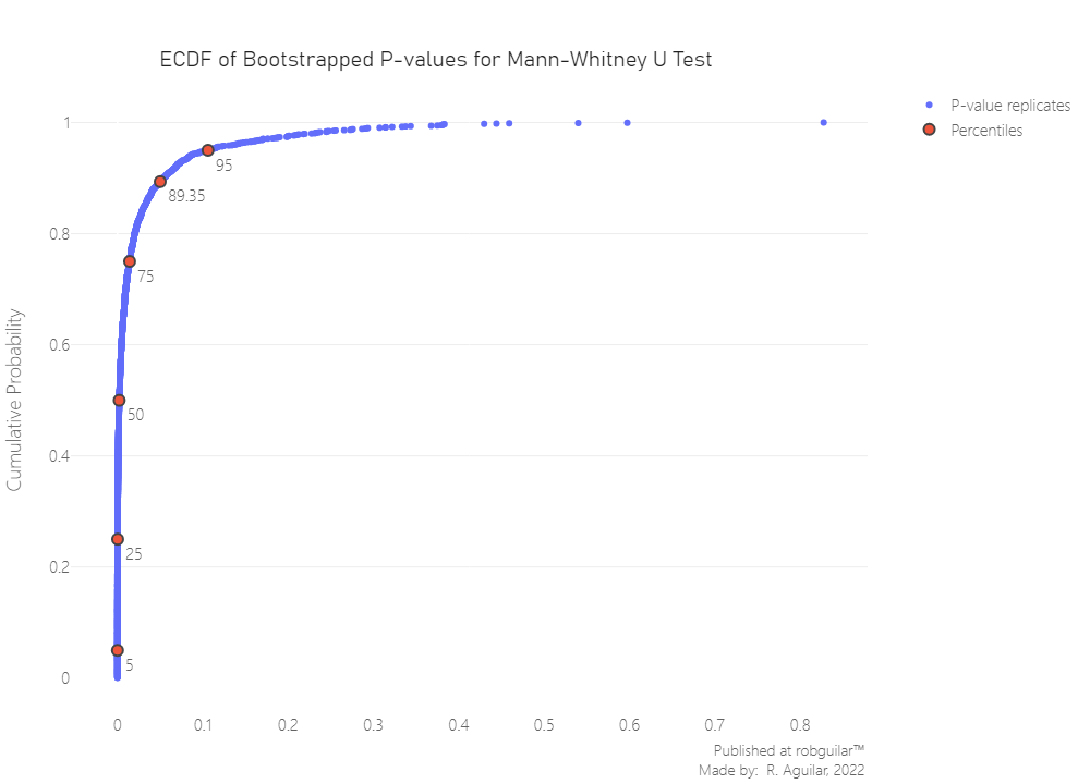
From 2000 iterations of the estimate, we can see that around ~90% of the bootstrapped Mann-Whitney U tests will have a value below 0.05 (in the hypothesis rejection zone). This indicates that the probability that a randomly drawn player from Midlaners or Soft Support will record more kills than any player is more than 50%. This approximately 90% of the time due to the significant difference in the distribution parameter.
With this, our next step is to restrict the analysis for Carry Heroes used in Soft Support and Midlaner positions, since these are the two positions where more kills are registered on the sessions.
After examining kills, we should study a more specific behavior, like the damage given to opponents by these same player records, and see if there is an unusual value in the different groups of heroes.
🧙♂️ Kruskal–Wallis One-Way ANOVA
First, we are going to try to test the difference between Carry heroes groups for Soft Support and Midlaners using a common One-Way ANOVA. Which is a parametric test which is used to test the statistically significant variance difference between 3 or more groups. In this case, our categorical variable will be the hero name, which will be used to segment the groups, to compare the hero damage factor between levels.
To select the hero groups, we can simply add the hero damage metric to use as a decision parameter, for this reason, let’s see the cumulative metric in a Pareto chart for the Carry heroes.
|
|
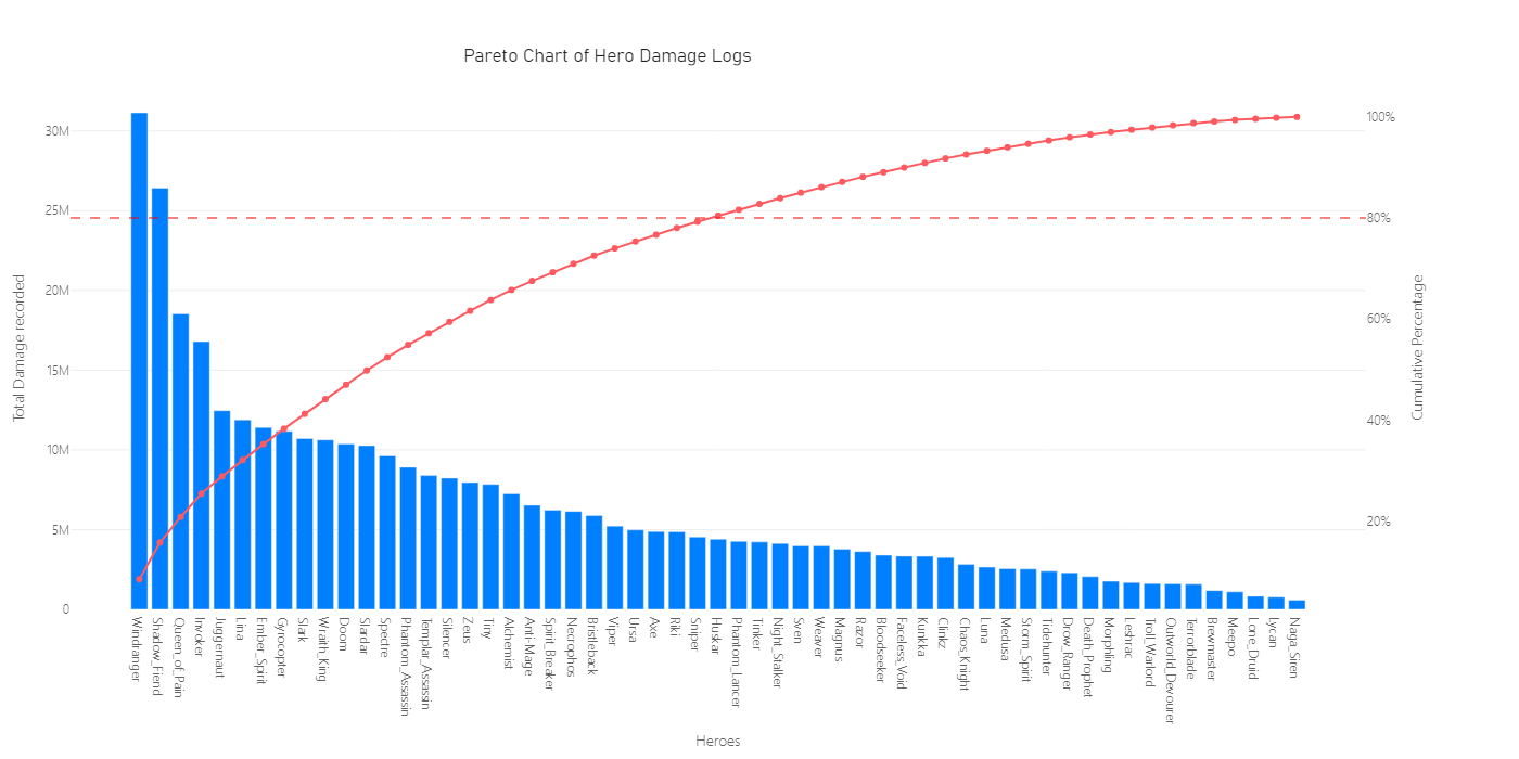
From the 110 different heroes, we’ll consider that 20% of them approximately allocated 80% of the total damage recorded. For this reason, we are going to subset those top 28 heroes that will be under study for our ANOVA test.
In the last visual, due to the size of the displayed area, we are not seeing the 110 heroes, but we can see the cumulative sum of damage recorded on the right Y axis of the Pareto Chart.
|
|
As we mentioned before, the specificity parameter is our focus point to make the right deductions, so we’ll still narrow our analysis to Carry heroes. The situation is that an ANOVA will tell us only if there is a hero Mean Damage is different from the rest.
To clarify the context of why we are going to use an ANOVA test, we have two reasons; the first is to check for potential nerfed heroes in later patches, that’s why our core KPI will be the damage, which is a continuous attribute; and the second one is that the comparison is made by a hero and fortunately we count with 28 heroes after the subset was made.
This way we can define the elements of the ANOVA as:
- Levels: Hero Names
- Factor: Hero Damage logs
And our Hypothesis will be defined by:
-
$H_0: \overline{X}_{Windranger} = \overline{X}_{ShadowFiend} = \overline{X}_{QueenOfPain} =$ … $= \overline{X}_{Riki}$
-
$H_1:$ At least one of the hero damage mean differ from the rest
Let’s establish the initial assumptions that we need to verify:
- Independence validation
|
|
To respect the independence assumption, we will extract one record per player in case the player count with multiple sessions logged in our sample. This is because we would prefer to have a randomized sample where the groups are mutually exclusive, since this process was made on the definition of the data_carry dataset, it’s not necessary now.
- Kolmogorov-Smirnov test: check normality on residuals
Based on an Ordinary Least Squares model where our independent variable will be the hero_name groups and our dependant variable the hero_damage, we can generate the residual of our model.
|
|
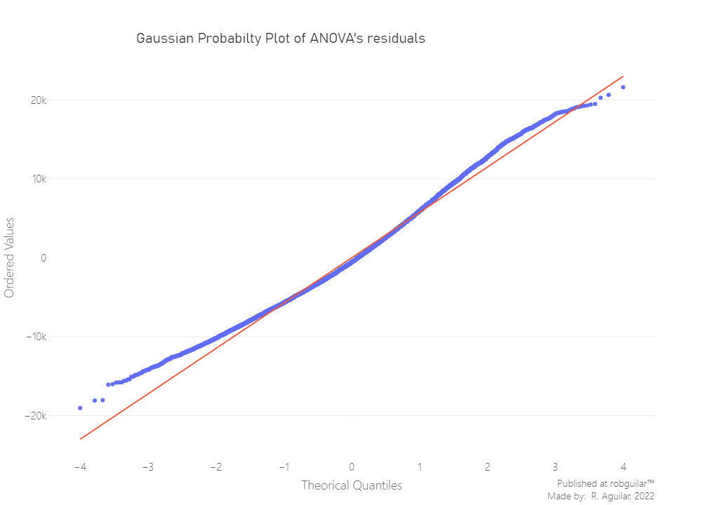
A visual check is helpful when the sample is large. As the sample size increases, the statistical test’s ability to reject the null hypothesis rises, so it gains the power to detect smaller differences as the sample size n increases.
From the last image, we can see on the left side, that the distribution tends to spread, and considering that we rely on approximately 20,000 residuals, we can conclude non-normality. However, the best way to decide this is to test it.
Here we shouldn’t use a Shapiro Welch since our sample is above 50 observations, the best way to test the Goodness to Fit a Gaussian distribution, is to use the Kolmogorov-Smirnov test. Notice that size of our data is a relatively large sample, the calculation of the p-value will perform better if we use an asymptotic method.
|
|
|
|
We have sufficient evidence to say that the sample data does not come from a normal distribution, since our Kolmogorov-Smirnov p-value is below 0.05. Knowing this we can’t proceed with a One-way ANOVA, so we have two options, we will proceed with a non-parametric version of ANOVA, the Kruskal-Wallis test.
|
|
|
|
The Kruskal-Wallis P-value in the rejection zone indicates that we have enough statistical evidence to reject the Null Hypothesis, meaning that at least one of the hero damage means differs from the rest.
Still, let’s generate a visual of the intervals, including the mean and standard deviation, to see which of the hero groups are generating that significant difference.
|
|
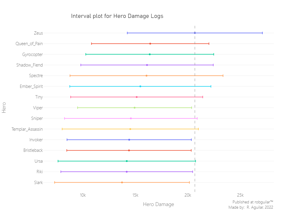
Effectively among 28 hero groups, we can see that there is a hero whose damage log confidence interval differs from others, this one is Zeus, and let’s explore his behavior overall.
|
|
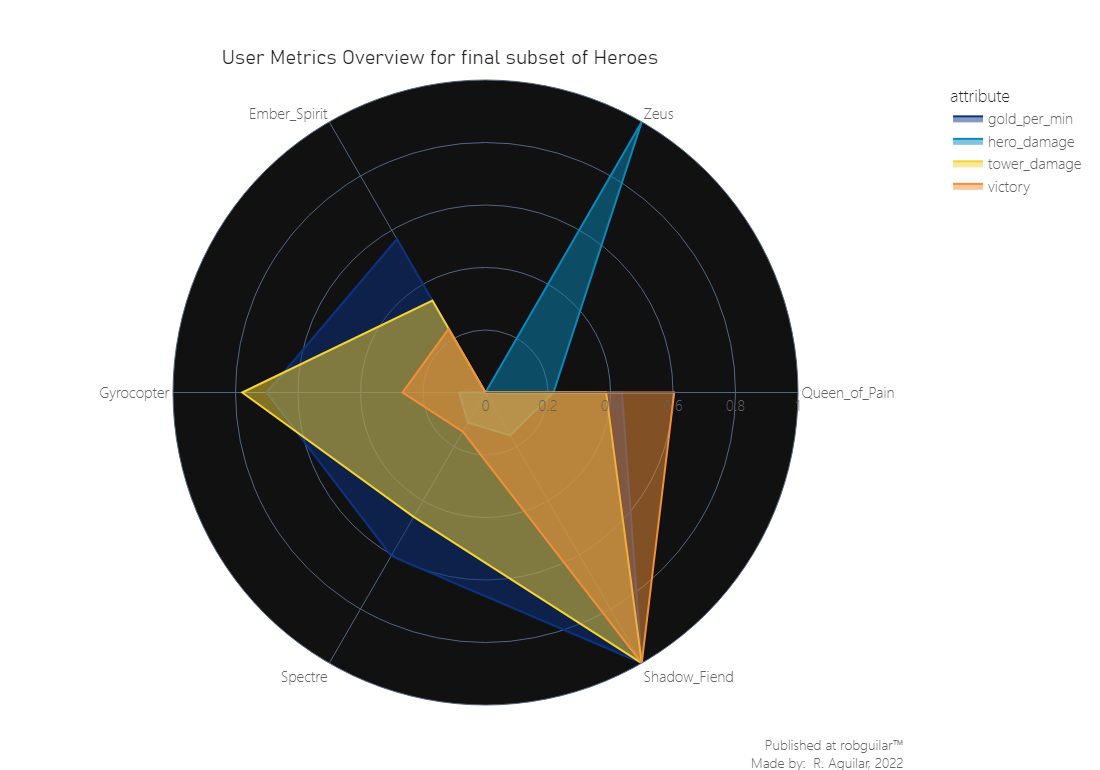
From the linearly scaled features we visited in the last graph, we can infer two interesting insights:
-
Shadow Fiend is the hero that presents the higher metrics in terms of gold collection, tower damage, and victories. This can be due to the ‘Requiem of Souls’ ability update, which is a wave turnover attack that was upgraded with the “Aghanim’s Scepter”, one of the most used in patch 6.86. And this because brings the capacity to reach a higher damage range, which was particularly useful for killing creeps and farming.
-
On the other side, Zeus has the higher damage registry, and the logs surpass by far the other heroes. This was because of several reasons, first in the patch, the developers released a remodel of the character, then this is a hero mostly used in Soft Support roles, so was probably used for Jungling, and then it is a ranged hero with one point of usage complexity, which made more straightforward his playability.
🗒️ Final thoughts & takeaways
What can the stakeholders understand and take in consideration?
At the beginning we were looking that the most buffed heroes, in terms of kills were different heroes like Riki, Huskar, and Ursa, however, unless we start using statistical tests applied to a behavioral metric like the damage dealt to enemies, we began noticing contrasts, where some heroes were registering higher victory values like Shadow Fiend and others high damage ranges without having superiority in term of sessions succeeded. For this reason, is preferable to base the conclusion upon statistical techniques to study subjective behaviors.
What could the stakeholders do to take action?
For now, the major concern of the Game Designer, should not be to take immediate action once they see this kind of insight. Instead, they can start collecting more granular data about the registries of damage logs changes, especially when abilities were introduced. Then can study two samples, one after the patch and another before, using the data archived, to run an A/B test to prove its veracity.
What can stakeholders keep working on?
MOBA games tend to rely their sustainability on their community engagement and this can be studied by the player’s user experience. Usually, when buffed heroes are used for Jungling, which among DOTA 2 community sometimes is a frowned upon activity, this will make the users feel uncomfortable because of unfair mechanics, so the main solution is to build a Gameplay Metrics dashboard segmented by characters to track closely its behavior and take prompter actions each time a patch is released.
ℹ️ Additional Information
- About the article
This article was developed from the content explained in the Inferential statistics section of Chapter 3 of the ‘Game Data Science book' and part of the statistical foundation was based on the book ‘Probability & Statistics for Engineers & Scientists’ by Walpole et. al (2016).
All the assumptions and the whole case scenario were developed by the author of this article, for any suggestion I want to invite you to go to my about section and contact me. Thanks to you for reading as well.
- Related Content
— Dota 2 Protracker Role Assistant by Stratz
— Game Data Science book and additional info at the Oxford University Press
— Anders Drachen personal website
— DOTA 2 Balance of Power Patch Notes
- Datasets
This project was developed with a dataset provided by Albert Cui, Howard Chung, and Nicholas Hanson-Holtry, which also can be found at YASP Academic Torrents or you can experiment with this great OpenDota API interface to make queries.
-
Footnote: We won’t find the raw data in the Github repository of this project due the storage capabilities, instead you will find a random sample with its respective preprocessing explanation in a Jupyter Notebook. ↩︎